Just a quick update on the progress of BoHM, this time talking about the tablet interface for the Gameslate.
The interface is made up of multiple panels, accessed through a pull down menu bar (which can be seen at the top of the picture below). For the first, Kickstarter, release, we will be focusing on everything the player needs to play the game, so that means a Character Generation panel, an Action Panel, a Music Panel, a Gear Panel and a digital Rulebook reminiscent of the Hitchhiker’s Guide to the Galaxy, which can be pulled down and read at any time from any panel.
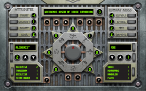
To illustrate, here is the first panel a player will use, the character generation panel, and a character that has been created using it – Nicodemus Bosch, a Ledite of House Capricorn (inspired by Jethro Tull, of course):
Using this panel, one can completely create a new character, save it, delete it or search through the database for other characters created on this tablet (we’ll be looking into transferring them over Bluetooth later this year).
The Bio Panel is the first stop, as this is where you create a name for your character. the six buttons, from left to right are: Search, which allows you to use the next two buttons, left and right, to flip through the various characters stored in the database; two buttons to delete or add/save a character, represented by a ‘-‘ and ‘+’; and finally a Text button that pulls up the keyboard so you can name or rename your character. The small number to the right of the name is the ‘Level’ indicator. Basically, this keeps track of how advanced the character is over a starting one. This makes it easy to manage experience on sight.
The Attribute and Combat Adds panels are fixed, as the names of the stats are constant, and only allow the rank of the relevant Attribute or Combat Add to be adjusted up or down by the use of the adjoining dial. BoL players will notice that there is no panel for secondary attributes built off of these, like Life Blood (or Fight in the case of BoHM). This is intentional, as these are automatically generated from the ratings on these panels and will show up, and be manipulated on the Action Panel.
The Career and Instrument panels are three part: the top allows you to dial through the relevant careers, and by hitting the text button on the bottom right edge, even allows you to add custom ones. This is particularly important for instruments, which aside from the standard grouping of Axe, Bass, Percussion and Voice, can include a wide variety of other sonic devices, as Nicodemus shows with his preferences for Flutes, Keyboards and Mandolins.
The second part of these panels allows you to dial in a rank for said Career or Instrument and then add it with the down arrow button, to your skill list or, if you want to remove a career or instrument, take it away again. Very simple.
The third, bottommost panel simply shows you the careers you have chosen along with their appropriate ranks. If you end up with more than 4, the handy dial will let you scroll through them.
The final part of our character generation panel is the Style Dial. This large central construct determines three things for your character: their School of Rock, which is indicated by turning the metal Roctagon so that the character’s school is at the top; the character’s ranking in various styles, indicated by the number in the radiating Rank Indicators adjacent to each schools position on the interior Rocktagon; and the opposition school, at the bottom, which is the only place on the dial without a radiating Rank indicator.
Ranking various styles is done by turing the central selection dial so that the arrow is pointing towards the appropriate school and then using the ‘+’ and ‘-‘ buttons at the base to change the number in the indicator.
The controls are all designed to look good and prevent accidental mishandling, hence the use of dials for a large number of selection points. I like dials on a touchscreen because they require a three step process to use: touch – drag – release. Unlike a plain button, which is simply touch, this means it is harder to accidentally change something by a simple misplacement of the finger.
There are buttons of course, but in accordance with the way people hold tablets, they are kept towards the center of the design so that any movement of the hand to access them will be largely deliberate (in theory, or course). This is also why the dial controls are mirrored on the left and right edges. Ease of use for the thumbs. And of course, mixing it up a bit helps to make the design more varied, hence the use of buttons for Style Ranks instead of Dials.
Once the character is created, all these numbers will be fed into the approriate spots on the other panels. The only place to change them, however (except in temporary cases, as when using equipment) is on this panel. This avoids accidental changes to the character during play and also allows the information to be presented in a more compact manner on the other panels, which is hugely important from a mobile platform perspective.
This panel is being broken up and the graphics added to the underlying code this week, and I’m currently putting the finishing touches on the Action Panel and Splash Screen panel (the in-progress version of which I placed at the top of the page). Hopefully, the Gear and Music panels will be finished by the end of the month so that we can get everything the player needs, sans Titans, ready for beginning of May. The Titan screen will probably have to wait until we can figure out how to get the tablets to communicate through Android, which might be a post Kickstarter deal, but progress is apace and I’m very happy with how it is turning out…


